Paint a stream with superfine oil colors. The depictions of landscapes and natural glimpses are very popular among painters who paint in oil. Of course, there is an infinite number of styles and ways to portray these subjects. We will show you how to do this using an impressionist style in the article you are about to read. The brightness and intensity of the colors of the painting by Werner Maier, who will be the protagonist of today’s guide, will immediately make you understand how we will set up the work: combinations of colors and tints, quick nervous and irregular brushstrokes, depth in reflections and details, only apparently inaccurate. What do you say? Did we intrigue you? Let’s start painting together?
What material we will use
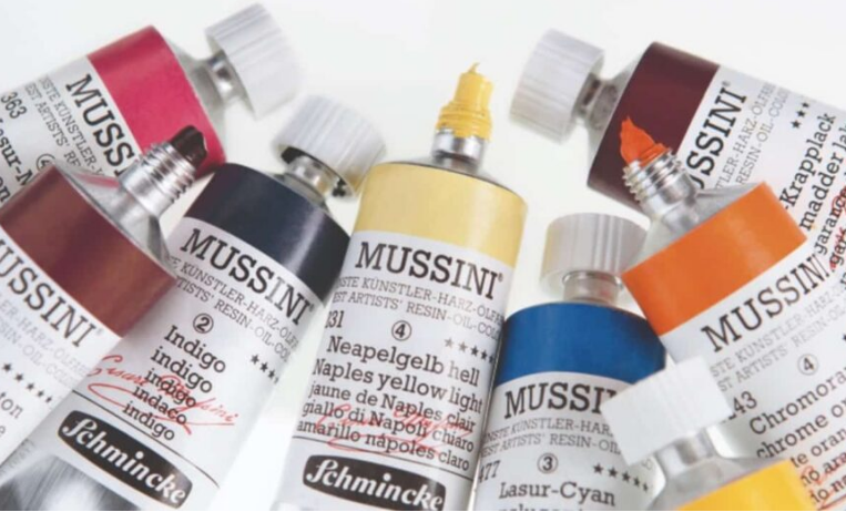
To create this painting with the splendid Mussini® superfine colors for artists in oil and resin. These colors have a truly unique peculiarity: they are defined as “resin-oil Color,” as they contain natural Dammar resin as an ingredient. It is combined with top-quality binders (linseed, safflower, and sunflower oils) and mixed with the purest pigments, and it creates professional-quality colors designed for true artists! Maximum possible light fastness, superior brightness, and the ability to resist over time without alteration.
Here is the list of the colors we will use:
Opaque Titanium White 103, Zinc White 102, Lemon Yellow 216, Cadmium Yellow Tint 209, Indian Yellow 223, Dark Naples Yellow 232, Cadmium Red Light 356, Transparent Magenta 363, Lacquer by Garanza alizarin 347, Cobalt Cerulean Blue 475, Dark Royal Blue 486, Light Ultramarine Blue 491, Indigo 478, Prussian Blue 490, Cobalt Turquoise 498, Natural Burnt Sienna 661, Sienna 660, Yellow Ocher Greca 656, Dark Ocher 653, Yellowish Green 530, Oriental Green 535, Forest Green 526, Natural Bohemian Green Earth 646, Natural Burnt Umber 666, Brown Van Dyck 667, Bluish Gray 1 784 and Black Ivory 780.
We define the design of the subject
We spread a Yellow Ocher undercoat on the white canvas cardboard using acrylic paint, in our case, PRIMAcryl® 13 675 Light Ocher. When the paint is completely dry, we trace the sketch using the red crayon. As for the composition of the drawing, pay attention to the central trunk, the one that overlooks the stream. It is positioned in the upper part of the picture and measures approximately 2/5 of the total length. Try not to draw a trunk that is too long. Stop well before the middle of the picture: by doing this, you will give more depth and harmony to the composition.
The light and dark tones
Now let’s complete our background, rolling out the light and dark colors. We always use acrylics, titanium white, and natural umber. In our case, we used the PRIMAcryl®, colors Titanium White (13 101) and Terra d’Ombra Naturale (13 677).
The depth of the subject
We paint the areas that appear farthest to the observer’s view, that is, the sky and the forest that stands out in the distance behind the stream. Finally, let’s start using Mussini® oil colors. Superfine colors for oil and resin artists! For the sky, he mixes Dark Royal Blue 486, Titanium White 103, and Cobalt Cerulean Blue 475. For the forest in the distance, he uses a base of Prussian blue that you can work with and lighten with Titanium White 103. The field in front of the forest is colored with Yellow Limone 216, Yellowish Green 530, and Dark Naples Yellow 232. As you can see from the image, the brush strokes remain very coarse and not too precise. We are only in the first phase, and in addition, this is an impressionist style painting and drawing ideas easy! Keep this in mind, and don’t get lost in unnecessary details for now.
The reflections of the water
I am fascinated by the reflections of the water in the stream. We could say that the sky’s blue dances among the waves, while the sun keeps it company reflecting itself on the water right in the middle of the composition. And, of course, the vegetation around the stream has also decided to mirror itself, revealing its vanity. It is certainly among the most complicated passages of the whole work, but also the one that, if well done, will catch the eye of the observer and give life to our painting.
For the sun’s reflections, we will use a mixture of Cadmium Yellow 209, Indian Yellow 223, and Zinc White 102. For the water, prepare and apply Light Ultramarine Blue 491, Cerulean Blue Cobalt 475, and Indigo 478. Take also Nero Avorio 780, and I’ll explain how to use it shortly.
The darker blues will help us increase the contrast and make the idea of the movement of the waves. We will gradually fade towards the lighter blues from the dark and reach the parts already painted in yellow. In the transition between yellow and blue, green will enter, which will arise precisely from the mixture of these two colors. To increase its brightness, you can add some Yellow Green 530 on top of the green you got.
Plants on the watercourse
In this step, we will paint the plants on the sides of the stream. First, we create shadows between the dam and the water using some Bruno Van Dyck 667 and Terra di Siena Naturale Bruciata 661. Then I add the branches on the left side of the painting, right in front of the forest, using some Terra di Siena 660 and Bruno Van Dyck 667. The thick foliage that enriches the bushes will paint using Yellowish Green 530, Oriental Green 535, Forest Green 526, Natural Bohemian Green Earth 646, and Natural Burnt Shadow Earth 666 darkened if necessary Indigo. Use Oriental Green 535 mixed with Cobalt Turquoise 498 to get the color of the leaves emerging from the darkness. The blue/green tint reflects the coldness of the shadow and, at times, recalls the hue of the stream’s waves.
The Final Touch
The finishing touch for this impressionist symphony of colors will be the stunning flowers that glow in their hues from pink to deep red. We use our trio of colors to paint them, consisting of Cadmium Red Light 356, Transparent Magenta 363, and Garanza d’Alizarina Lacquer 347. If we want to darken them, especially in the shaded areas of the hanging bushes, we use Light Ultramarine Blue 491. To lighten them and make them brighter, we will always use Covering Titanium White 103.